Tuesday, June 12, 2012
Tuesday, June 05, 2012
Another short movie I'm working on. It's more of an art piece. A reflection on loneliness and isolation. I've worked out what I feel is the general look and feel by developing a title sequence.
I liked what Digital Kitchen did a number of years back with the intro to "the Company"https://vimeo.com/38177875 A very somber moody evocative montage. It tells a story without being an overt narrative. That's hard to do.
Here's what I came up with. It's a little dark but I'm o.k. with that. I feel it sets the tone nicely for how I'll treat my subject matter.
I liked what Digital Kitchen did a number of years back with the intro to "the Company"https://vimeo.com/38177875 A very somber moody evocative montage. It tells a story without being an overt narrative. That's hard to do.
Friday, June 01, 2012
Monday, May 21, 2012
Parrot Island
I meant to post these and then got swept up in the next client driven project.
I was asked to flush out the look for a social game by a small start-up called Pixiee Games.
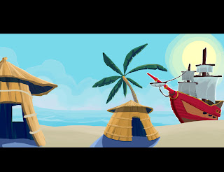
The theme was Desert Island w/ Pirates and monkeys, and Parrots. What's no to love right?!! the initial sketch got things going in the right direction but needed some redesign
I was asked to flush out the look for a social game by a small start-up called Pixiee Games.
The theme was Desert Island w/ Pirates and monkeys, and Parrots. What's no to love right?!! the initial sketch got things going in the right direction but needed some redesign
The theme was Desert Island w/ Pirates and monkeys, and Parrots. What's no to love right?!! the initial sketch got things going in the right direction but needed some redesign
Once the design and layout were in place, refining the painting was the next challenge. They wanted something that had a "Disney" feel.
My early paintings were getting to bogged down in details and were starting to get a little painterly. Not the flat, vibrant geometric quality they were looking for.
Brighter and simpler at this phase but still a little to much going on with texture . The quality of the tone and saturation was starting to come together though.
Finally got to a place where both tone and textural elements were coming together and the levels were starting to feel right.
The huts start taking on the kind of 'flat' look that the client is after. There excited and I'm happy I can cross one more thing of the list of needs that I'll want to address
The Details on the huts and the rigging in the boat are the last items to embellish.
Push the levels, contrast and saturation and call it a day. A happy desert island
any pirate would love to pillage!Saturday, May 19, 2012
Designing w/ a grid adds order to the chaos that the creative process often brings. Using a grid is easy in Illustrator or InDesign. Both apps allow the user to save and import a grid as a template. Photoshop doesn't have the same function. The best alternative is to create paths/convert to lines using brush tool/ then save and place that grid as a template into a new doc.
1. Blank PSD doc
A grid can be the calm that the creative storm needs. Adding structure and stability making a page feel clean and easy to read.
1. Blank PSD doc
2. Grid
3. Path tool converted to stroke ( 2 pt width)
4. grid placed in PSD doc with images
5. images layout using grid
Tuesday, May 15, 2012
Subscribe to:
Comments (Atom)


